the brief
The art of diplomacy is embracing the common thread of humanity, celebrating individuality, and encouraging diversity.
That's how this New York-based luxury streetwear brand defines themselves.
I joined the Diplomacy team as a Multimedia Designer, initially creating email blasts and designing internal documents
like linesheets and invoicing reports, but quickly had to step up to a position that was much more demanding than that.
As the sole in-house content creator for the brand, my duties branched into higher level digital and print design as well as
assisting marketing, sales, logistics, and event management.
My design work at Diplomacy helped establish a visual language that communicated high-end sophistication and edge.
print collateral


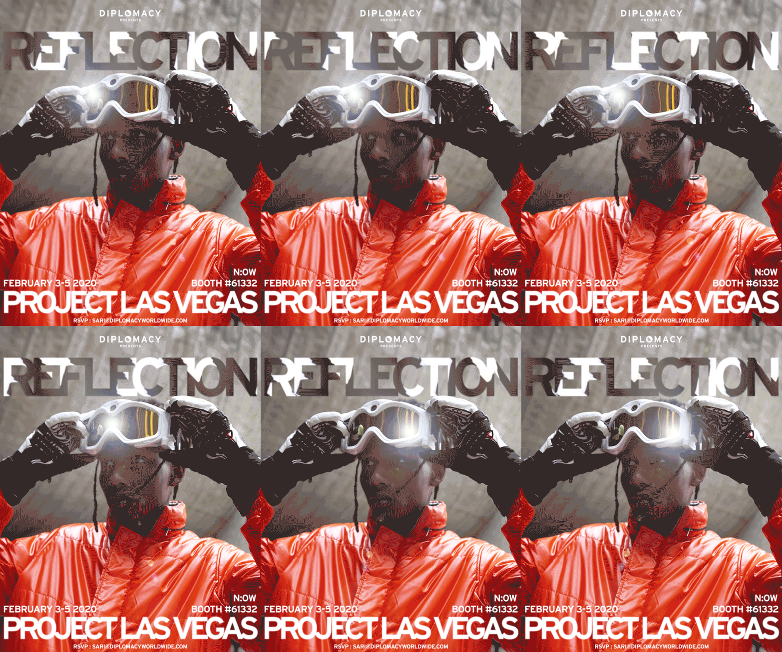
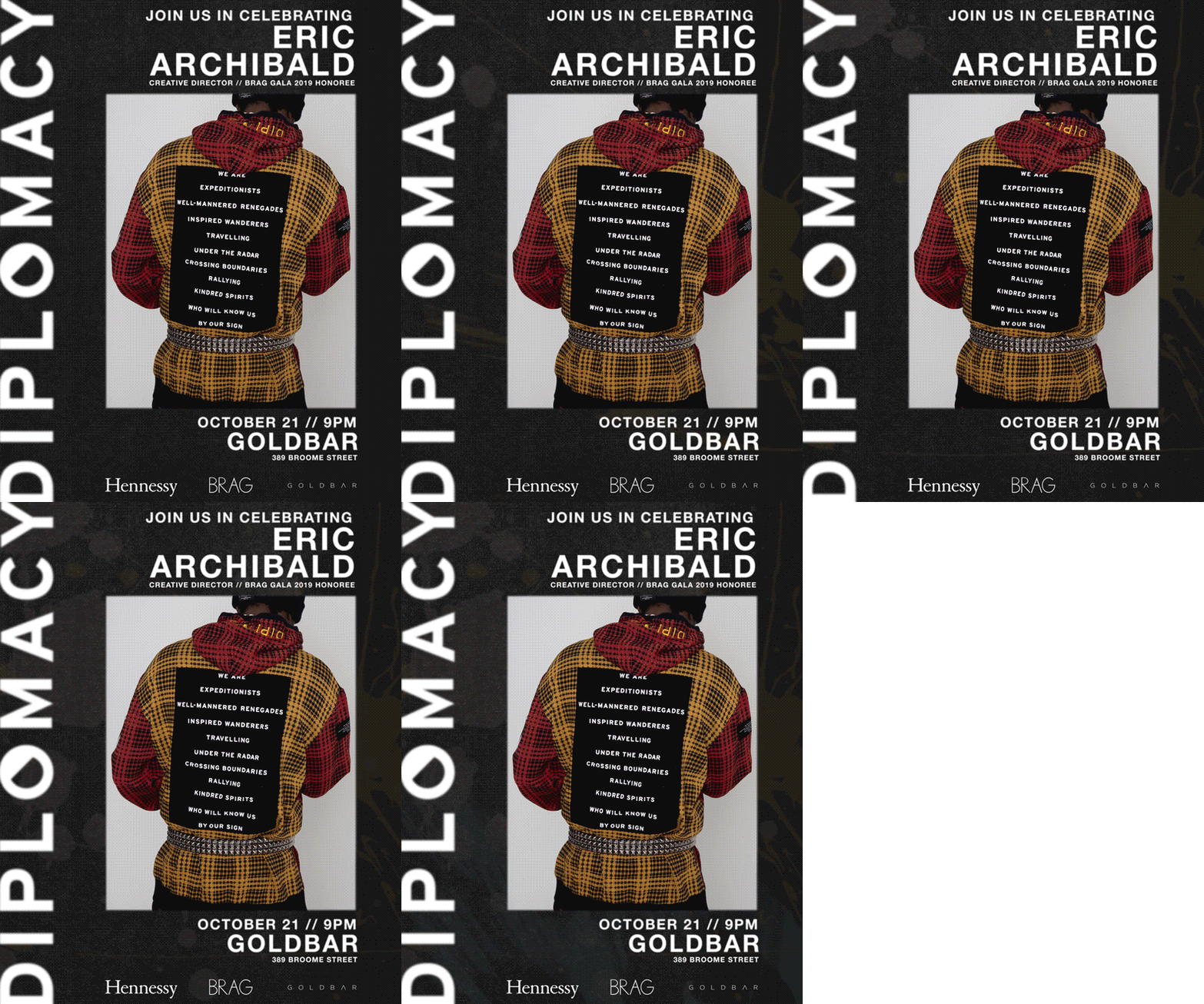
Most sales assets must be created for cross-platform use, including web, email, and print.


Fashion cycles work a full year in advance, so the architecture of a collection needs to be forecasted with enough integrity to tell a story, and enough elasticity to go through a full year of iteration. This Fall / Winter 2019 lookbook is the product of that balancing act.
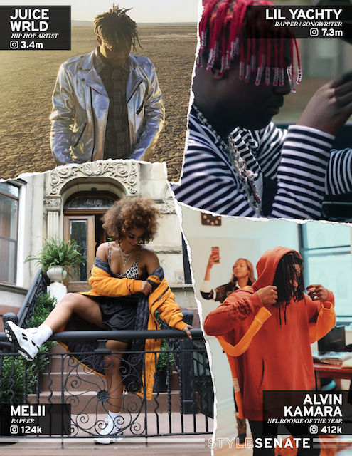
Press and marketing materials are incredibly important assets for winning a sale. In most cases, this press kit is the first set of visuals seen by an industry outsider looking in.
Press and marketing materials are incredibly important assets for winning a sale. In most cases, this press kit is the first set of visuals seen by an industry outsider looking in.
brand identity

old logo
The panda in the old logo was meant to represent uniqueness & individuality, further accented with an eyepatch. It was clear to me that this graphic element was the last artifact of a much older iteration of the brand identity, and in order to elevate the ethos of Diplomacy, the wordmark needed to take one more step in the refinement process.

This problem yielded a ton of exploration. A logo for a fashion brand demands versatility with multi-faceted application, from screen printing to embroidery to plastisol lettering, as well as digital and print usage. I wanted to simplify the panda graphic while still paying homage to the brand DNA, as well as create a standalone symbol that could signify the brand.

new logo
Ultimately, my solution was a simple one. I left the Interstate Bold font choice intact while introducing a simplified interpretation to the panda eyepatch symbol. The new stand-in for the "O" in Diplomacy not only strengthens readability, it is a characteristic glyph that has been inscribed with its own unique meaning.
marketing
The reach of the marketing I took the initiative on was predominantly for web. Email blasts, promo videos, and a social media presence became a formidable content launch for a one-person marketing team.


This is a very brief snapshot of the work I did with Diplomacy. You can see more at @diplomacyworldwide or www.diplomacyworldwide.com !


